Portfolio > Jolly Roger
Goal: A usable audio call UI that fits into a 300px wide sidebar.
Background
Jolly Roger is a puzzle hunt team management and puzzle solving productivity application developed by members of the MIT Mystery Hunt team Death and Mayhem. In late 2020 I consulted on the user interface for per-puzzle audio calls, designed and developed in time for the the first remote MIT hunt in January 2021.
Constraints
The Jolly Roger puzzle page UI must leave enough room for an embedded spreadsheet within the dimensions of a single laptop screen. The audio call box must share the left sidebar with the existing text chat feature, so it could neither be any wider than the chat section nor excessively tall.
Jolly Roger uses React Bootstrap as its UI library, so my design would have to look congruous with the rest of Bootstrap.
Background research
Google Meet
Video call support was not in scope for this project, but I took inspiration from (an earlier version of) Google Meet's video call UI.
I liked how Google Meet's colorful, edge-to-edge viewer boxes in shared-screen mode, with initials for users with video turned off. It also shows who is talking/making sound with a volume bar-esque overlay.
Zoom
Zoom's UI was anti-inspiration for my design.
To show who is talking, Zoom either makes the current speaker big (in "presenter" mode) or puts an outline around the speaker's rectangle (in "gallery", or "Brady Bunch," mode). With a back-and-forth conversation, the "presenter" slot obnoxiously flashes back and forth between participants. In "gallery" mode, the current speaker is indicated by a narrow outline—a cue both easy to miss and completely unrelated to the information it's supposed to convey. Another drawback of both views is that there is no support for indicating that multiple people are speaking at once.
Zoom's participant boxes are ugly: the rectangle used has poor proportions (human faces are taller than they are wide! why are these boxes extra-wide?) and the placeholder for a user without video is either a tiny avatar image or full name text floating in empty space.
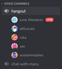
Discord
I also looked at Discord's audio chat UI. Although each user-item is compact vertically, with one user per row the total size would be taller than a tileable interface for a typical number of puzzle solvers. A Discord-style list wasn't going to leave enough space for the text chat box below without scrolling—which would risk users missing that people are talking below the scroll.
UI design
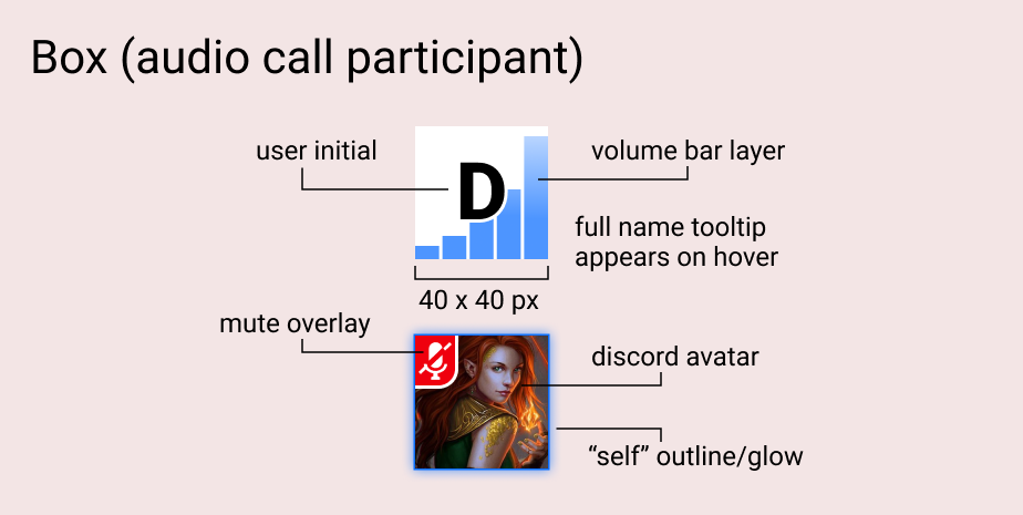
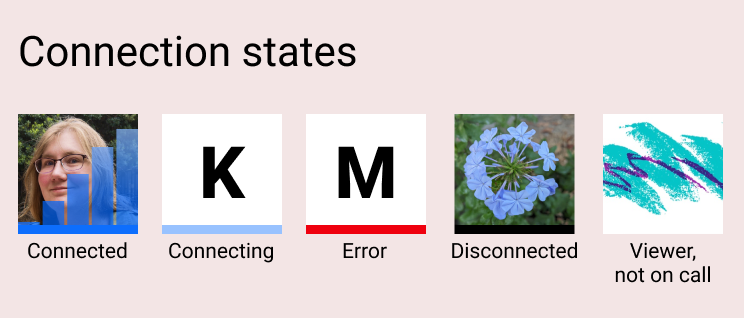
In the first version of the audio UI, the colored line at the bottom of the box was useful for debugging calls with varying real-world network configurations. (In a later version of the software, the audio call backend changed such that these statuses were no longer relevant, so we removed them.)
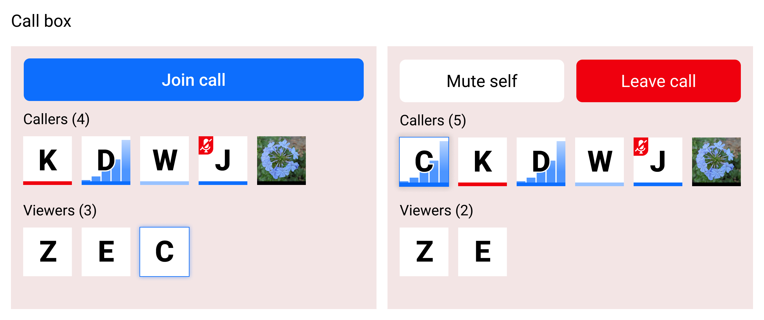
At this size, the boxes were easy to tile and even when wrapping they didn't crowd out the text chat part of the sidebar below them.
By showing boxes for viewers as well as callers, the audio call UI replaced a separate viewer count feature (used as a heuristic for whether this puzzle already had enough people working on it or if it needed more attention). Even better, now users would know who was viewing the puzzle page.