Portfolio > Weddings
Marit and Eric
In 2023 I made a last-minute wedding program design for a nerdy Minnesotan couple.
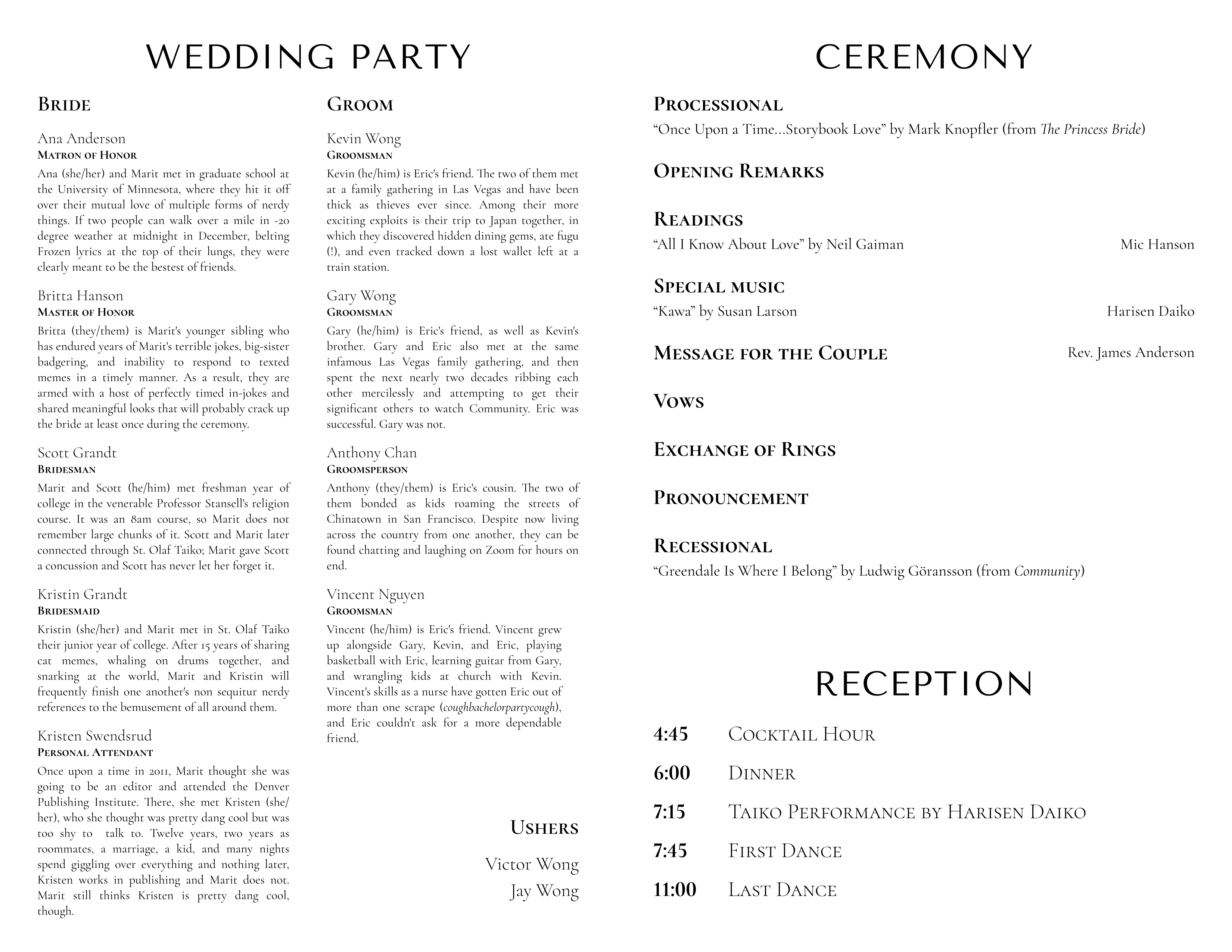
Given the timing, the bride and groom were preoccupied with other tasks so I had minimal guidance on the design, other than that it should be grayscale and fit on a single sheet of paper to fit into their budget. For typefaces I took my cues from the couple's wedding website. The bride sent me most of the copy but I edited it down so that all the attendant bios would fit.
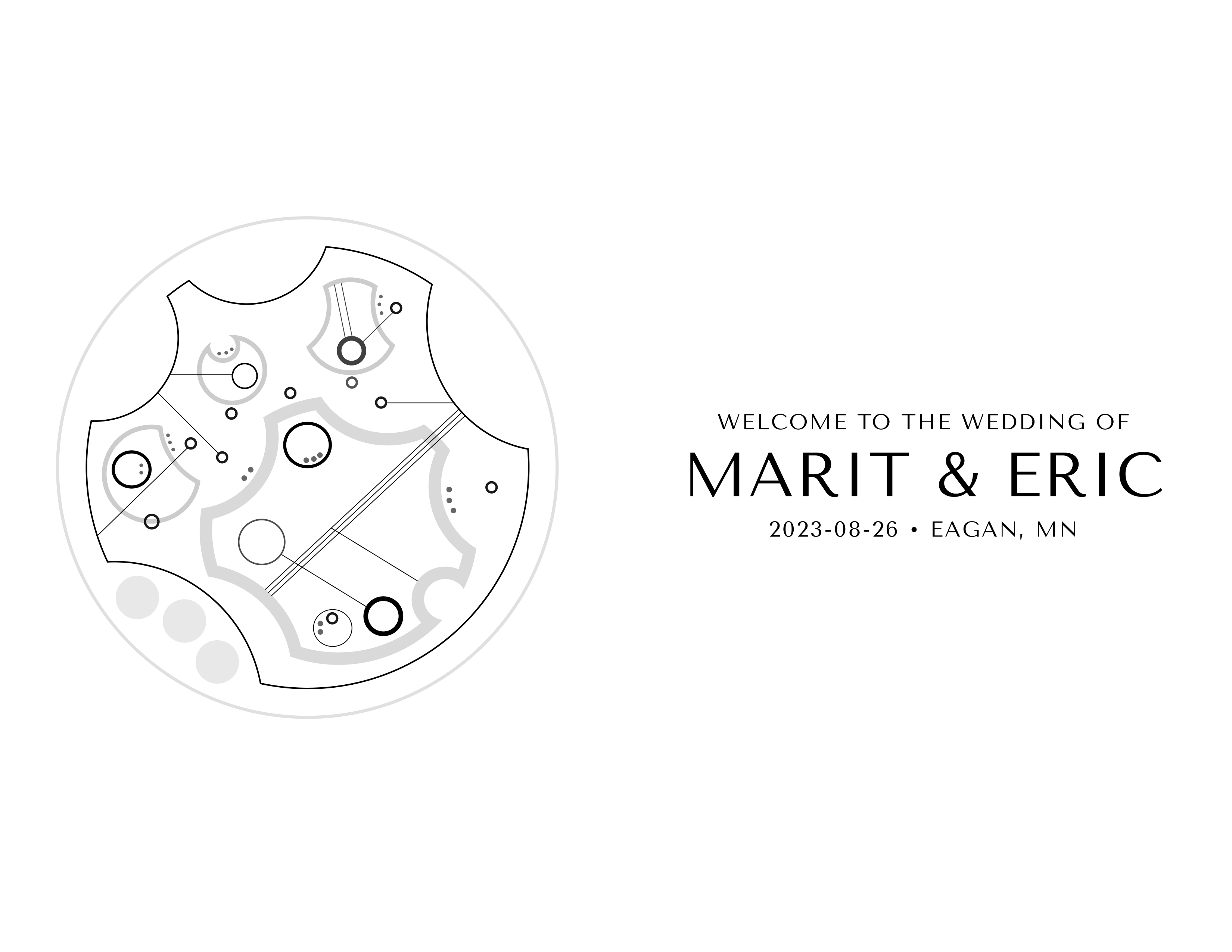
The save-the-dates for the wedding were Doctor Who-themed so I drew a message in Gallifreyan, the constructed language used in the show, for the back cover. I found an automatic Gallifreyan generator but the output was unattractive: lines stuck out every which way, colliding awkwardly; the word scale was perfectly even and boring; the smallest dots ran into each other. I looked up a language guide so that I could 1) follow the language's phonetic bigram model and 2) make the design more "calligraphic" by positioning circles and reusing lines.
For those not in the know, the back design looked like a geometric pattern. For the über-nerds in attendance, however, it said:
(([Ko] N G [Ra] [Tu] [La] [Shu] N S)
([Ma] [Ri] T])
(A N D)
(E [Ri] K) !)
The bride's reaction when I sent her the first draft:
OMG YOU READ MY BRAIN
I was hoping for a cover that was similar to the invite but I totally forgot to mention it
Thank you SO much. You have no idea how much stress you [sic] taken away.
Aaron and Eleanor
In 2018 I designed programs, placecards, and the menu board for a Jewish wedding in northern California.
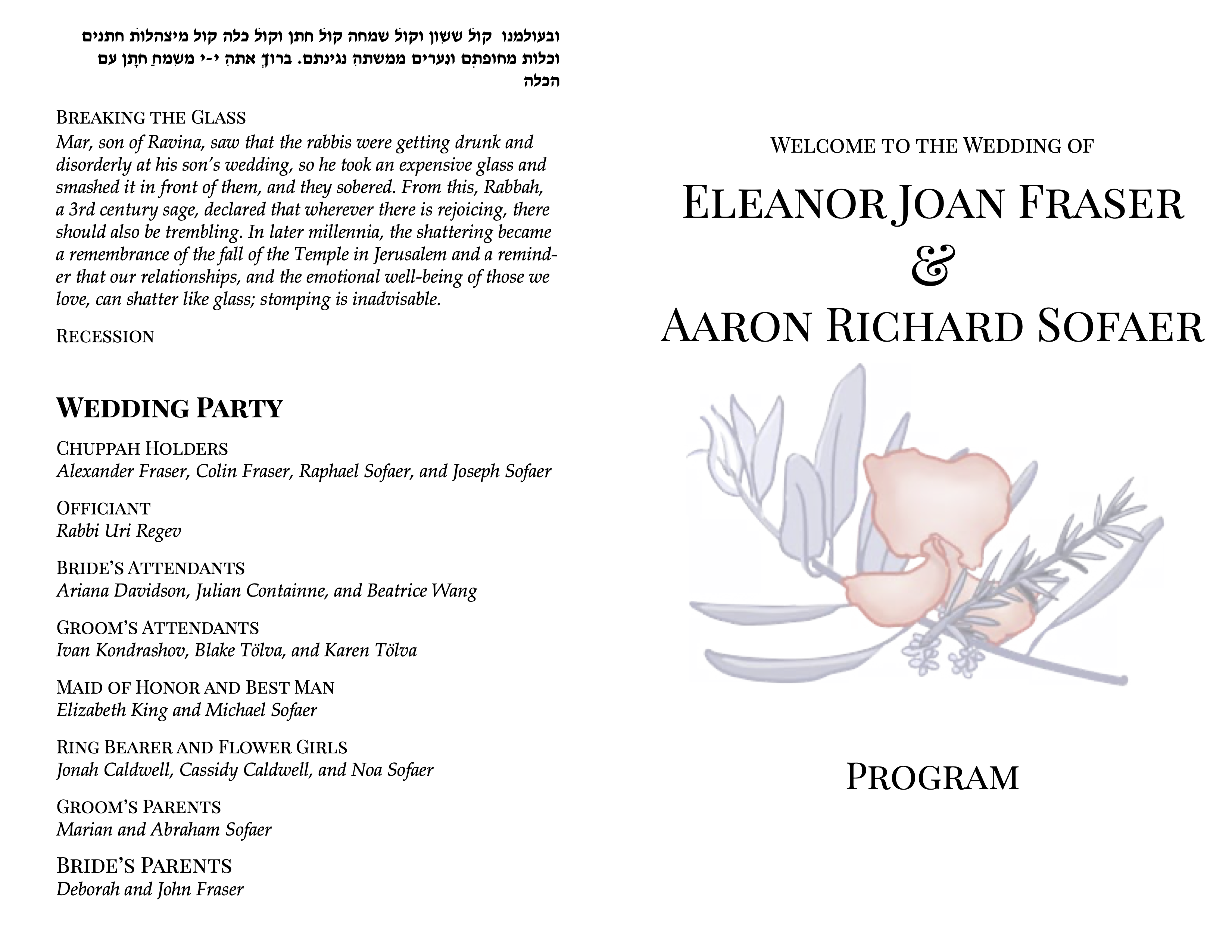
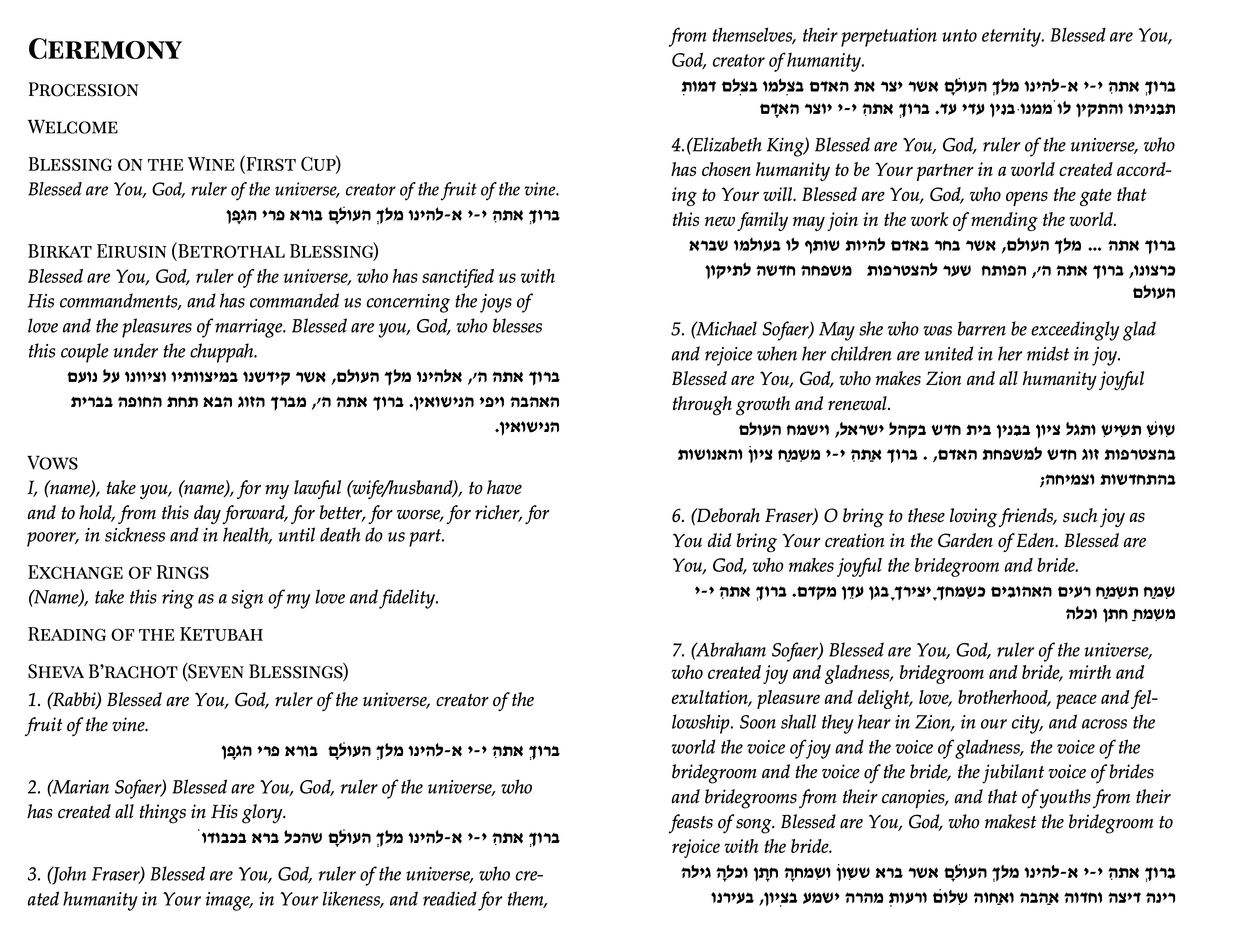
The couple didn't desire in-depth bios for their attendants so I kept that content compact. However, it was important to the couple to include all the ceremony readings in both English and Hebrew to help attendees follow along (especially since the bride's side was not Jewish).